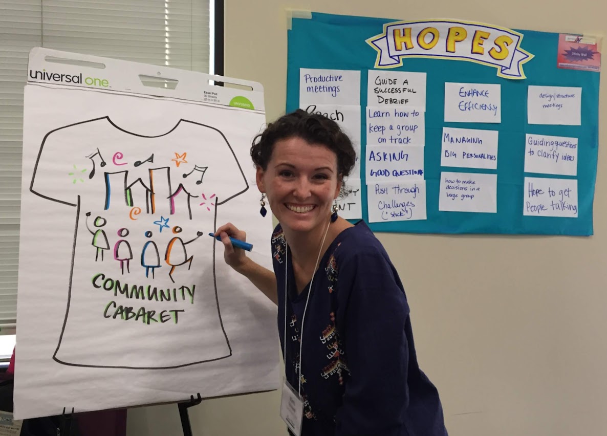
What makes a flipchart go from flat to fabulous?! It’s one simple line that makes all the difference.
Make your flipcharts leap off the wall with easy, anyone-can-do-it borders!
Why bother to border?
A border can add a professional, polished look to a flipchart and enrich visual appeal. It can also help to convey a sense of the flipchart’s purpose or theme.
What’s more, without a border, the edges of a flipchart can blend in to the surrounding environment, making it hard for people to focus on the content. Adding a border can help to define its boundaries and keep the eye and the mind lasered in on what’s important.
Just a simple black box around the edge of your poster is all it takes. But why not take it up a notch with these easy upgrades!?
Break out those lesser-used colors like red, yellow and orange to make it pop.
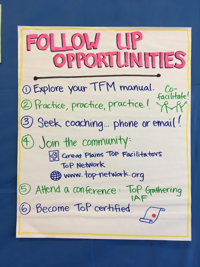
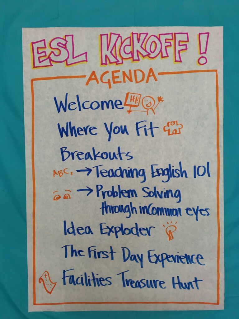
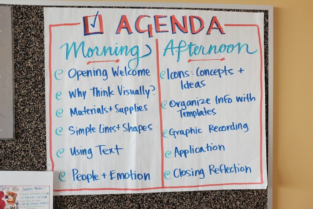
Try adding a fun pattern.
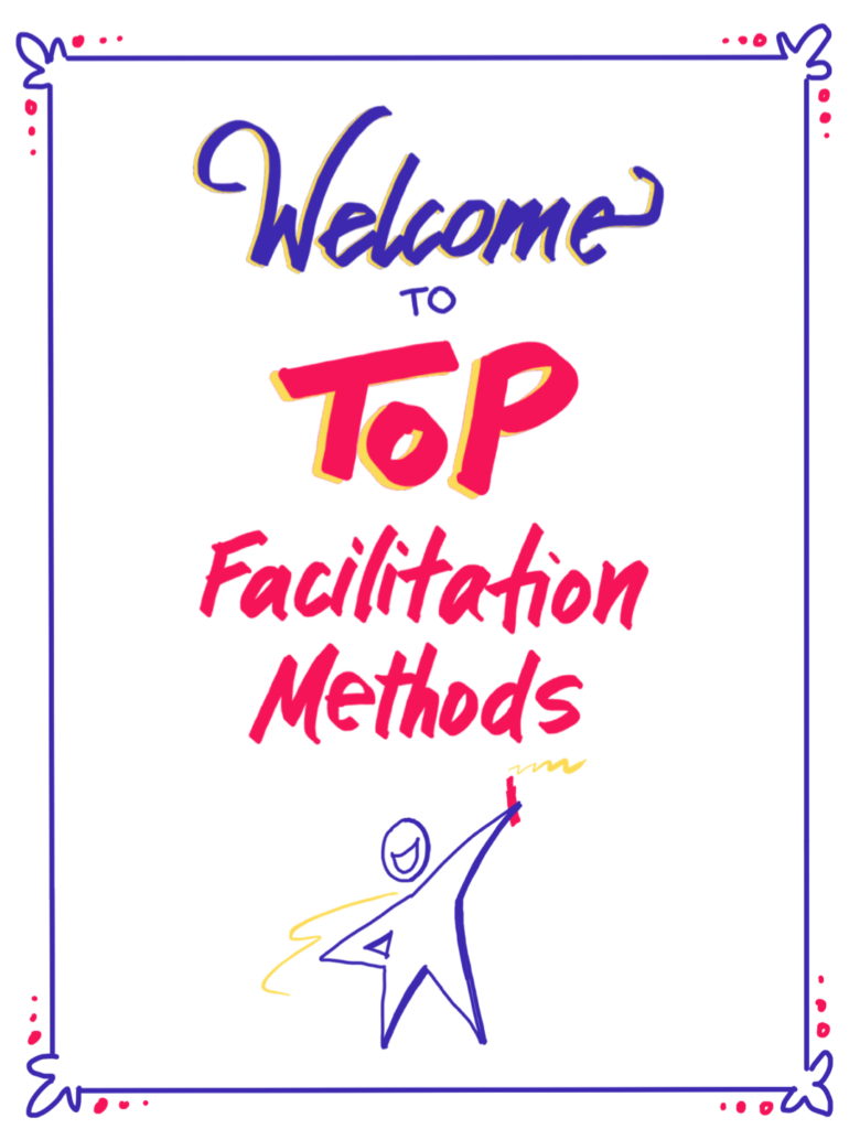
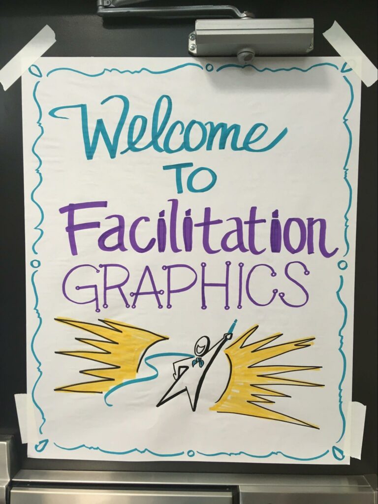
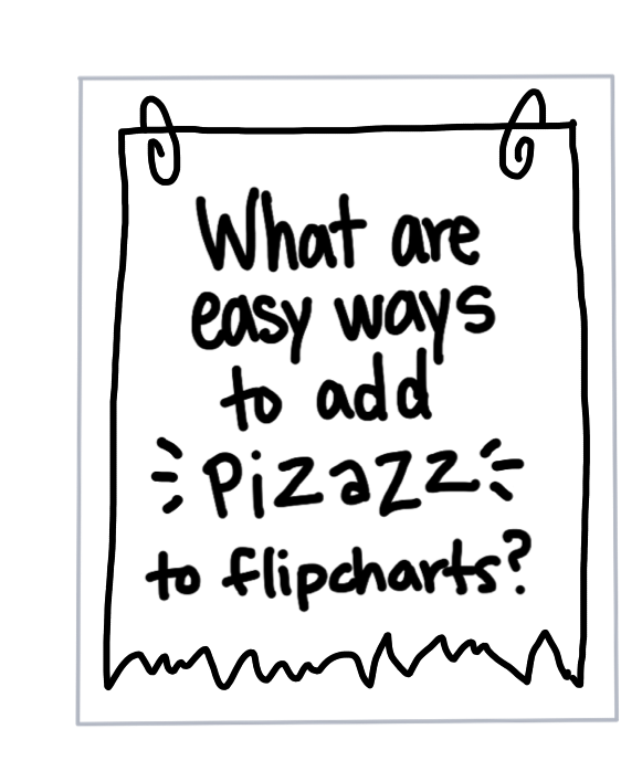
Get funky by adding doodled paperclips, staples, hole punches…
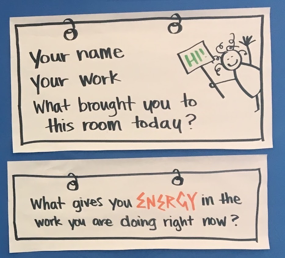
Integrate simple images into your border that reinforce the topic.
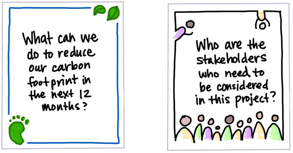
If you really want to focus on the content, shrink your border to frame JUST what’s important… and even get rid of the extra paper!
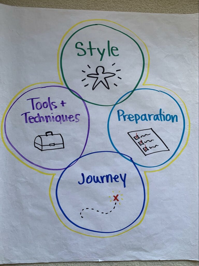

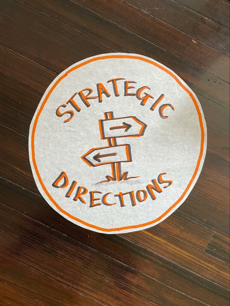
Which of these simple tips will you try on your next Focus Question, Group Agreements, or Notes page?
Learn and practice borders (and a whole lot more!) in our limited-time Facilitation Graphics course, coming to Omaha on April 27.
Practical tips to improve your scribing ✏️
How to doodle like a PRO: capturing people, emotions, and ideas in imagery 🤪
Using color, space, and icons to create flip charts that impress 📊
Structures and frameworks for organizing ideas visually 👀
So many secrets about sticky walls, markers and more that you never knew you were missing!! 🤫
Finally, get a sneak peek at new, printable ToP poster sets and leave with a kit of art supplies to keep your creativity flowing when you get home.
Tap into your inner 7 year old and build your skills step-by-step so you feel confident using text, color, and graphics to enrich your facilitation work (and your whole life, really). Come join us!
